
How to Build an App Onboarding Flow That Converts (2026)
A widely cited study of 1,460 onboarding flows found something counterintuitive: users aren't afraid of a long onboarding, they're afraid of a bad one. Here's what actually separates the two, with real screen recordings from three onboarding flows worth studying and the 10 best ever built.
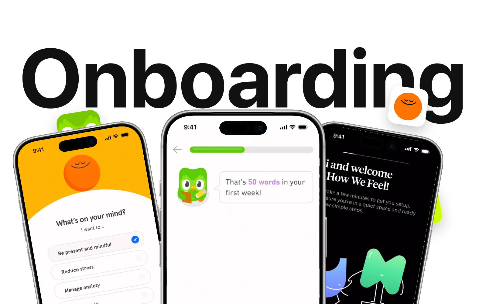
A recent analysis of 1,460 onboarding flows, run by the UX research group Mobbin across 986 real apps and websites, landed on a finding that cuts against most product advice: length isn't the problem. Finance and health apps, the categories that need the most trust from a non-technical user, run the longest onboardings in the study, and they convert. What actually kills onboarding isn't a few extra screens. It's a bad screen: one that asks for something before it's earned, that overwhelms with choices, or that shows a paywall before the user has felt any value.
That distinction matters because the data on what happens when onboarding goes wrong is stark. Mobile analytics benchmarks put first-step drop-off at 37% of new users, and apps that push past 5 screens without a clear reason lose another 10 to 15% of completion per additional screen. Nielsen Norman Group's usability research finds a matching payoff on the other side: users who complete onboarding tend to stay active far longer than users who abandon it partway through, as the chart below shows.
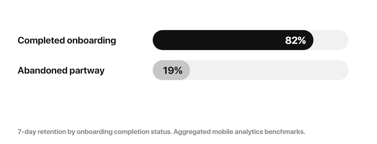
Users who complete onboarding are far more likely to still be active a week later than users who abandon it partway through.
Below: what a good onboarding actually has to do, three real flows filmed screen by screen (How We Feel, Headspace, Duolingo), the 10 best onboarding flows ever built, and the mistakes that quietly kill completion.
Contents
- What onboarding actually has to do
- The anatomy of an onboarding that works
- Three real onboarding flows, screen by screen
- The 10 best onboarding flows ever built
- Mistakes that quietly kill completion
- Building this into your own app
- Frequently asked questions
What onboarding actually has to do
Before any design decision, onboarding has one job: get the user to a moment where they feel the product's value, as fast as honestly possible. Everything else, the account creation, the permissions, the paywall, should happen around that moment, not before it.
RevenueCat's State of Subscription Apps report ties this to a specific number: users who don't reach that moment within 60 seconds rarely come back, and apps that cut their time-to-value in half see 7-day retention climb 25 to 40%. That's the entire argument behind every onboarding pattern below, personalization, progressive disclosure, and delayed paywalls: they all exist to get someone to that first "oh, this is useful" moment faster.
The anatomy of an onboarding that works
Personalize before you explain
The fastest way to make an onboarding feel relevant is to ask the user what they want before you tell them what your app does. Headspace opens with "What's on your mind?" and a short list of goals (stress, sleep, focus) before showing a single feature. It's a two-second question that turns a generic tour into something that feels built for that one person.
Progressive disclosure beats a wall of screens
Psychologists have measured this since the 1950s: Hick's Law holds that the time it takes someone to decide grows with the number and complexity of the choices in front of them. In an onboarding flow, that shows up as decision fatigue. More than 3-4 choices on one screen and completion rates can drop by up to 60%. The fix isn't fewer questions. It's fewer questions per screen. Spread the same information across several focused steps and each one stays easy to answer.
Reward before you ask for anything
This lines up with BJ Fogg's Behavior Model out of Stanford: a prompt only works when motivation is already high enough, and asking for an account before someone has felt any value asks for motivation the app hasn't built yet. Duolingo's onboarding lets you finish a real first lesson before it asks for an account. By the time the signup screen appears, you've already learned something. The app has proven its value before asking for anything back. That single reordering, product first, ask second, is behind more onboarding case studies than any specific screen design.
Ask for permissions exactly when you need them
Nielsen Norman Group's usability research has repeatedly found that a blank state with no context is enough to make most users abandon within the first session, and an unexplained permission prompt produces the same reaction. Duolingo doesn't ask for notification access on a blank system dialog. It leads with "I'll remind you to practice so it becomes a habit," then triggers the native prompt. Same permission, a dramatically different acceptance rate.
Three real onboarding flows, screen by screen
Screen recordings from real App Store listings, trimmed to the moments worth studying.
How We Feel: friction that's genuinely optional
How We Feel, iOS · onboarding flow
How We Feel is a mood-journaling app built with a nonprofit's editorial restraint, and its onboarding shows it: warm hand-drawn characters, a welcome screen that explains what's coming in plain language, and a visible "Skip setup" link under the main button. Most apps hide the exit. How We Feel puts it in view, on the theory that a user who feels free to leave is more likely to stay through the setup they didn't have to do.
Headspace: a mood set before a single feature is shown
Headspace, iOS · onboarding flow
Headspace's onboarding opens with the personalization question, "What's on your mind?", then moves straight into the trial terms with the exact numbers up front: 14 days free, then the monthly price, a plain three-step timeline of when you'll be reminded and when you'll be charged. Nothing about the paywall is vague or hidden. It's still a paywall this early in the flow, a rare case where an app trusts total transparency over a delayed ask.
Duolingo: reward first, then a permission with a reason
Duolingo, iOS · onboarding flow
This clip captures the sequence that makes Duolingo's onboarding a reference: a specific, personal reward ("That's 50 words in your first week!"), immediately followed by a notification request framed as a favor ("I'll remind you to practice so it becomes a habit!"), then a home screen widget prompt with the same logic ("I'll cheer you on from your home screen!"). Every ask in this sequence is preceded by a reason stated in plain language. None of them are the generic system dialog with no lead-in.
The 10 best onboarding flows ever built
A working list, not a fixed ranking. These are the flows most worth studying for a specific reason each.
- Duolingo: the reference for "let them use it, then ask." A real first lesson before account creation, then every follow-up ask (notifications, widget) is framed as a favor.
- Headspace: art direction that matches the promise before a single feature screen. Calm colors, slow transitions, and full transparency on trial terms.
- Calm: sells a feeling, not a feature list, from the first screen. Sound and motion do the persuading that copy usually has to do elsewhere.
- How We Feel: a nonprofit's editorial restraint applied to onboarding. Warm, honest, and openly optional with a visible skip link.
- Airbnb: onboarding as trust-building, not feature tour. Photography and host stories carry more weight than any button copy.
- Robinhood: turns a legally required, information-heavy KYC flow into something that still feels like a product, not paperwork.
- Notion: a rare onboarding built around a blank canvas, using templates to solve the exact blank-state abandonment problem that sinks most productivity apps.
- Strava: asks about your sport before your name, so day one already feels tailored to a runner, cyclist or swimmer specifically.
- Tinder: the shortest time-to-value on this list. Profile setup is fast because the actual product, swiping, is one tap away.
- Slack: proves onboarding can be genuinely funny (its early Slackbot conversation is still referenced years later) without losing the thread of what the product does.
Mistakes that quietly kill completion
- A paywall before any value. The single fastest way to lose a user who would have converted a few screens later.
- More than 3-4 choices on one screen. Split it across two screens instead. Completion holds, and decision fatigue doesn't set in.
- Permission prompts with no lead-in. A one-line reason before the system dialog changes the acceptance rate more than the design of the dialog itself.
- Treating every onboarding as identical. A fintech or health app earns the right to a longer flow because trust is the product; a utility app does not.
- No visible way out. Forced setup with no skip option reads as friction even to users who would have finished anyway.
Building this into your own app
Every pattern above, personalization questions, a reward before the ask, permission prompts with context, a paywall that waits, is a design decision you make once, in the flow, not a feature you bolt on later. That's exactly the layer Bloxks builds alongside the rest of your app: describe the onboarding you want, and it generates the real screens, in order, as native code, not a set of mockups you still have to implement.
See your onboarding take shape
This is the same workspace you use to create the flow: describe the experience, iterate on each screen, then open the live preview to see how people will move through it. You are building a real app, not a static prototype.
You can adjust the personalization questions, move the reward moment, and decide exactly where the paywall sits, then publish to the App Store from the same place. No separate onboarding tool, no handoff to a developer to wire it up.
Publish to the App Store and Google Play in a few clicks
When your app is ready, Bloxks prepares the store submission from the same workspace. Our AI generates the assets and metadata you need, so you can move from your finished app to the App Store and Google Play without assembling every store listing by hand.
 Build your onboarding with Bloxks →
The verdict
The apps that get onboarding right don't have the shortest flows on this list. Headspace's trial terms take real estate; Duolingo's reward sequence runs several screens deep. What they share is that every screen earns its place: it personalizes, it rewards, or it asks for something with a reason attached. Cut screens that don't do one of those three things. Keep the ones that do, however many there are.
If you're building that onboarding yourself, describe it to Bloxks and get the real screens, not a prototype, then take the whole app to the App Store from the same flow.
Frequently asked questions
How long should an app onboarding be?
As long as it needs to be to build trust and personalize the experience, not one screen shorter. Finance and health apps tend to run the longest onboardings of any category, and it works, because every extra screen earns trust with a non-technical, risk-aware user. The rule isn't screen count, it's whether each screen clearly earns its place.
Should you ask users to sign up before or after they see value?
After, whenever possible. Duolingo lets you complete a full first lesson before asking for an account. You experience the product, not a form, first. Apps that gate value behind signup or a paywall convert worse than apps that let users feel the product first.
What's the single most common onboarding mistake?
Showing a paywall before the user has felt any value. Close behind: asking for permissions with no context, and presenting more than 3-4 choices on a single screen, which triggers decision fatigue and can drop completion by up to 60%.
How do I build an onboarding like Duolingo's without hiring a developer?
Describe the flow you want to Bloxks: the personalization questions, the reward moment, where the paywall sits, and it generates the real screens as native code, not a mockup. Adjust the order, the copy and the timing of the paywall directly, then publish to the App Store in one click.